
Premium Tea From Taiwan: Tea Top SoCal
SUMMARY
The client purchased a popular franchise bubble tea shop from Taiwan called Tea Top and opened up their own shop in June 2018. As the first Tea Top franchise in Southern California, we wanted to focus on redesigned a mobile web app that culminates all the touch points and translate the marketing opportunities to a product.
MY ROLE
UX/UI Designer

PROBLEM
Tea Top has a generic website for all Tea Tops in the U.S., but client needed a website that they can customize in order to emphasize on marketing to their target audience and assist customers to select a drink from a wide variety of drink options. As a new tea shop, customers are unfamiliar with their menu and with over 50 different drink options, customers can often feel overwhelmed. The abundance of choice should help customers feel limitless, but often causes customers to spend more time making decisions or have buyers remorse.
SOLUTION
In order to help customers choose a drink, we decided to create a feature that helps users sift through the menu and guide them step-by-step in the decision-making process. This feature acts as a virtual guide that will inform customers about the wide variety of drinks and also suggest drinks depending on the users' preference. We understand that a key part of good customer service is being an outstanding matchmaker, matching a product based on the customers need so we focused to deliver a personable recommendation list for the indecisive users.
THE RESEARCH
CLIENT BACKGROUND
A couple purchased a bubble/boba tea franchise from Taiwan called Tea Top with over 100 locations in Taiwan and 5 locations in Northern California, but this is the first location in Southern California.
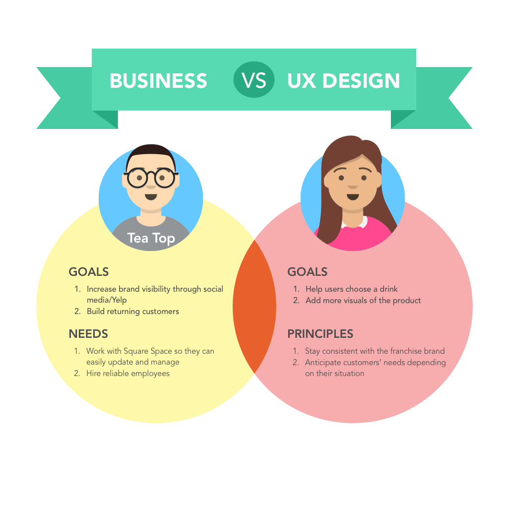
BUSINESS REQUIREMENTS
Before we tackled this project, we discussed business requirements, constraints and summarized our priorities in order to deliver a site that combines UX as part of their digital marketing strategy.
HYPOTHESIS
We believe that customers feel overwhelmed with decisions when they see a menu with a diverse selection. We will create a feature that allows customers to access a list of personable recommendations. We will know this to be true when we receive data from Squarespace Analytics showing at least 20% of web visitors exploring the hand-picked recommendation feature.

competitive analysis
I selected the top three competitors provided by the client to understand the market and find potential opportunities. I conducted a competitive analysis to identify strengths and weaknesses. This revealed which areas were key to improve our user flow and content hierarchy.
Research

To learn more about our potential users’ habits and behaviors, I created a survey and interviewed users in order to:
Understand the criteria and the thought process of choosing a drink
Understand the different methods users use to place an order
Research what information users are looking for when visiting a bubble tea website
After gathering information from 44 survey participants and 8 interviews, I identified key numbers and patterns from the data:
Choice of the drink depends on their mood, stomach capacity, lactose intolerance, diet restrictions and time of day
The majority 42% preferred to order through the business' website or delivery apps vs. 31% that preferred the traditional way of calling over the phone
7 out of 8 interviewees agreed that choosing a drink from a menu that has over 50 different drinks and 8 different toppings can feel paralyzing
ANALYSIS
PERSONAS
Interviewing customers at a local tea shop and reading Yelp reviews, I started crafting personas. I decided on three primary personas reflecting on three main target audiences- first-time customers, regular customers and a customer who caters. Understanding their pain points lead me to our products main goal: to give customers a filtered recommendation list based on their needs.

USER STORIES
I complied a list of tasks user would want to accomplish by using the website based. Together we prioritized using the moSCow method. See attached user stories.
DESIGN

SITE MAP
Based on the user stories, I created a site map using Balsamiq. We made sure to include our MVP-our feature that recommends drinks based on the customers' needs.
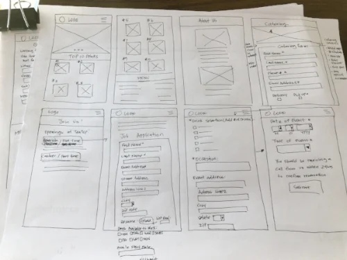
SKETCHING
Call me old school, but I prefer to sketch out my initial designs with a pen and paper because it's easier to change and it helps me get a clear vision before tackling the designs on the computer.
Initially, I added a checkout process after the user went through the drink recommendation feature, but the client had 2 third-party delivery apps and adding another online check out would require him to upgrade plans for his website host.

WIREFRAME
BALSAMIQ LO-FI
Reviewing the competitive analysis gave me a basic guideline on structuring the layout. I used Balsamiq to transfer my paper sketches on to the computer. I converted these wireframes into InVision in order to share my mockups with my client remotely. I also used this to conduct user testing.

HIGH FIDELITY PROTOTYPE
As I was transforming my wireframes into high-fidelity prototypes, I focused to build screens that are consistent with the original Tea Top USA's page and the brand.

A/B USER TESTING

A/B TESTING
I came across this article, "Kill the Hamburger Button" and it discusses how we should replace the hamburger menu with tab bars due to the inefficiencies. However, during my competitive analysis, all of the competitors used a side menu bars to display their options. This made me question, so why do all the websites use the side menu bar? Is it true that the users dread it, but designers are not listening or do the designers detest the look at a user? In order to find out, I decided to test out the menu option myself through Usability Hub.
RESULT
The results are in and it's true! Out of 30 participants, 88% of users preferred the tab bar.
It's clear that the users preferred the tab bar, but the real challenge is convincing the client and making it possible on Squarespace. After talking to a few experts on Squarespace, it seemed to be difficult to customize without a coding background. Since the client felt reluctant to hire a web developer, we chose to keep the sidebar menu.
KEY LEARNING POINTS
I felt disappointed since I didn’t get to see my designs come to life, but nevertheless, this was a great learning opportunity to experiment and validate designs. This partnership has taught me the importance of documenting the design process in a manner that stakeholders can understand, as well as communicating the design process to a client that is unfamiliar with the UX process.
Now, I truly understand why side menu bars are not always the best option for users. It's one thing to read about it in articles and another to experience it first hand!